
CSX Design System for Rail Applications
Led the design team and worked closely with UX developers to create a consistent design system to streamline application development of responsive web and mobile rail applications. The system was demoed in the CSX Showcase, which provided examples of how to implement UI elements following established design patterns, as well as code snippets and instructions to help developers expedite development.
Role: UX & UI Designer
Design Tools: Axure, Illustrator
Client: CSX

The Problem
No established design system led to an inconsistent look and feel across applications. Elements like search/navigation patterns, icons, and labels differed wildly even when presenting the same data.
Rail employees who needed to access multiple applications simultaneously had to learn new ways of completing similar tasks as they switched from one app to another. This increased processing time and confusion.
Developers creating new applications or updating existing ones duplicated outdated code and branding, or implemented non-standard design patterns that weren’t user-friendly.

The Solution: CSX Design System
We introduced the design system through an app called the CSX Starter Showcase, a single source to view patterns, icons, styles, code snippets, and links to documentation.
Our system hierarchy consisted of:
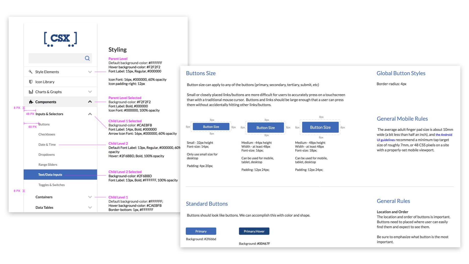
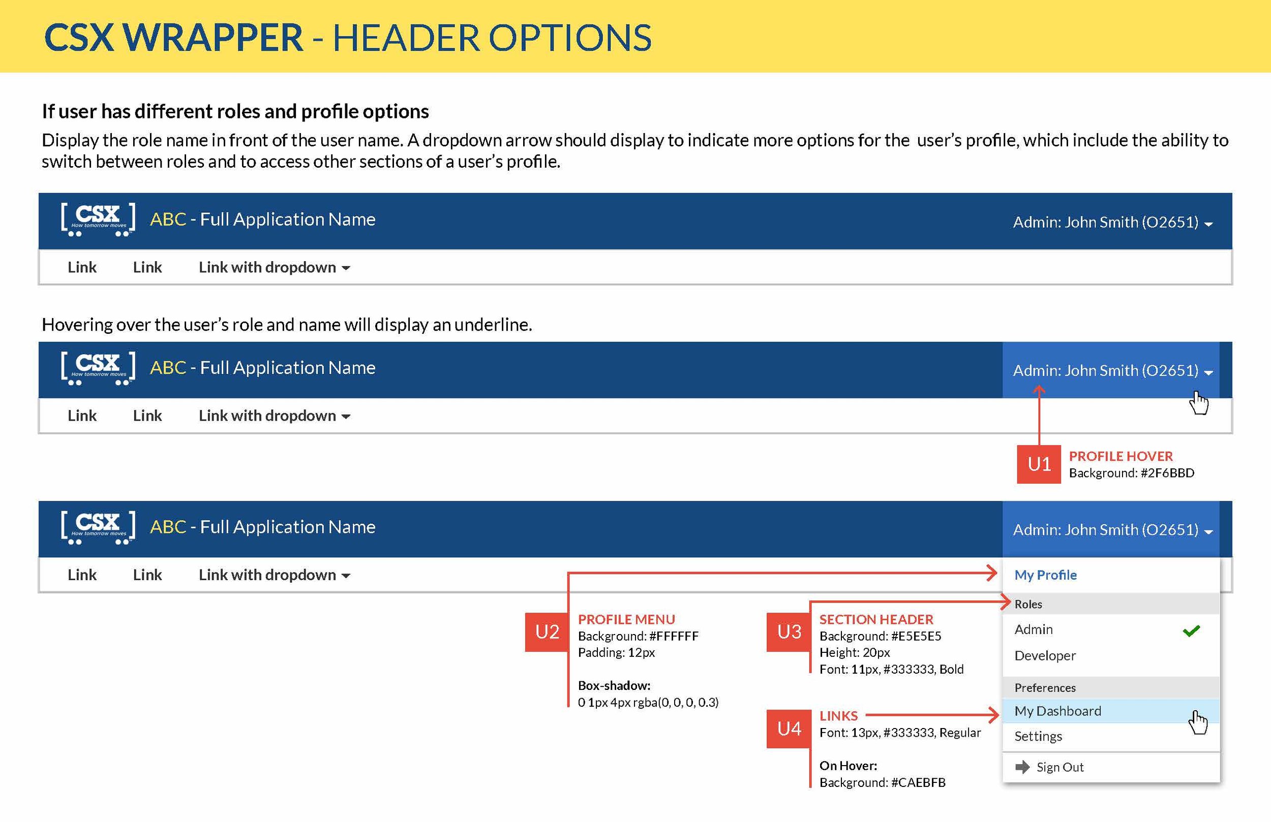
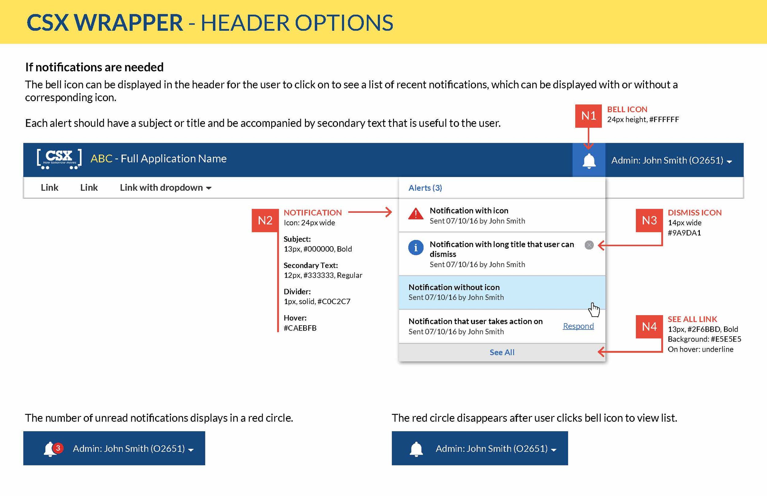
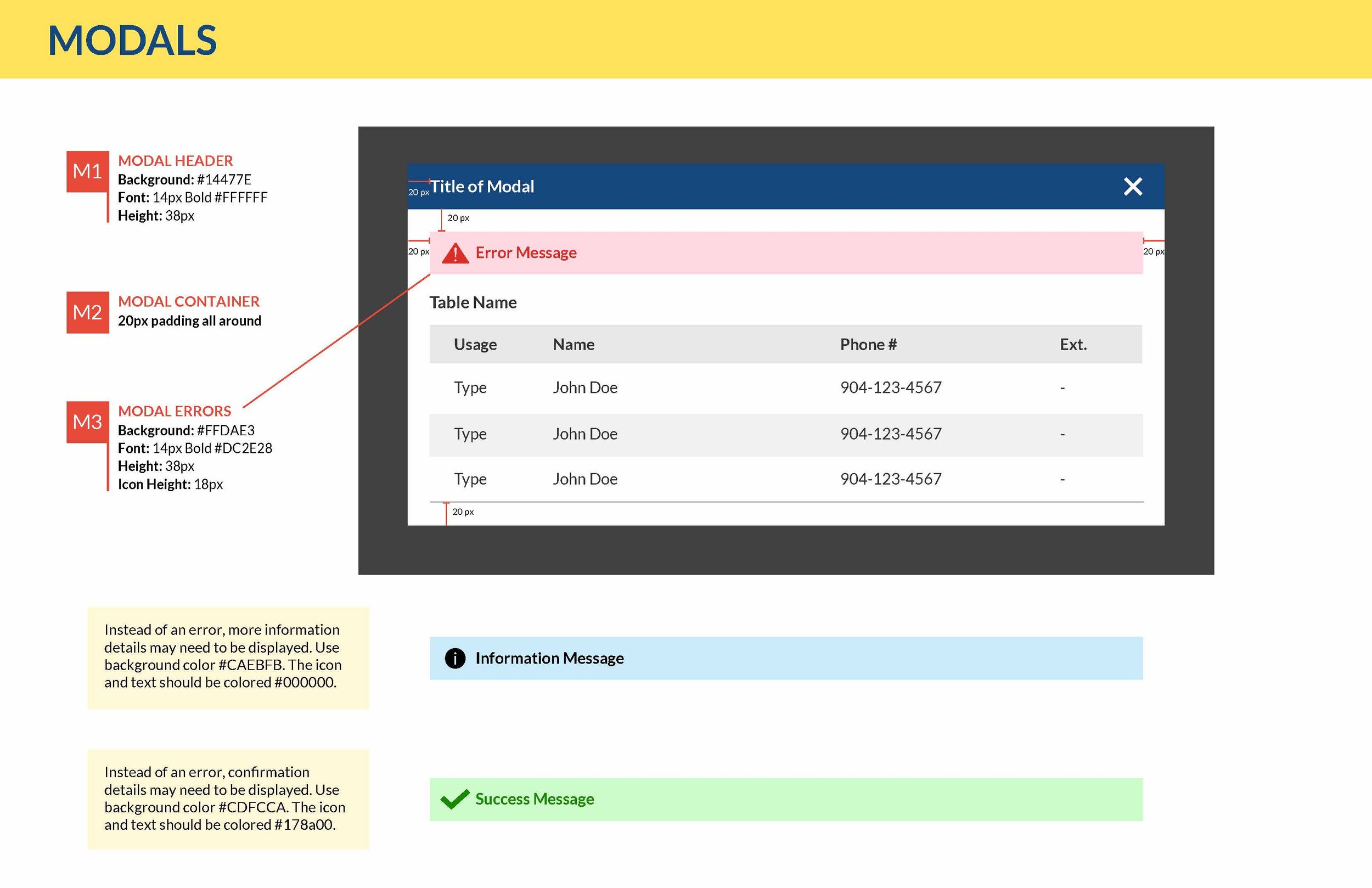
COMPONENTS - Basic UI building blocks of our user interface (the smallest functional unit).
MODULES - Groups of two or more components combined together to function as a simple or complex unit. The UX team created a collection of custom modules tailored for our rail applications.
PAGE TEMPLATES - Pre-designed pages containing the structure and interaction design for common layouts and design patterns.
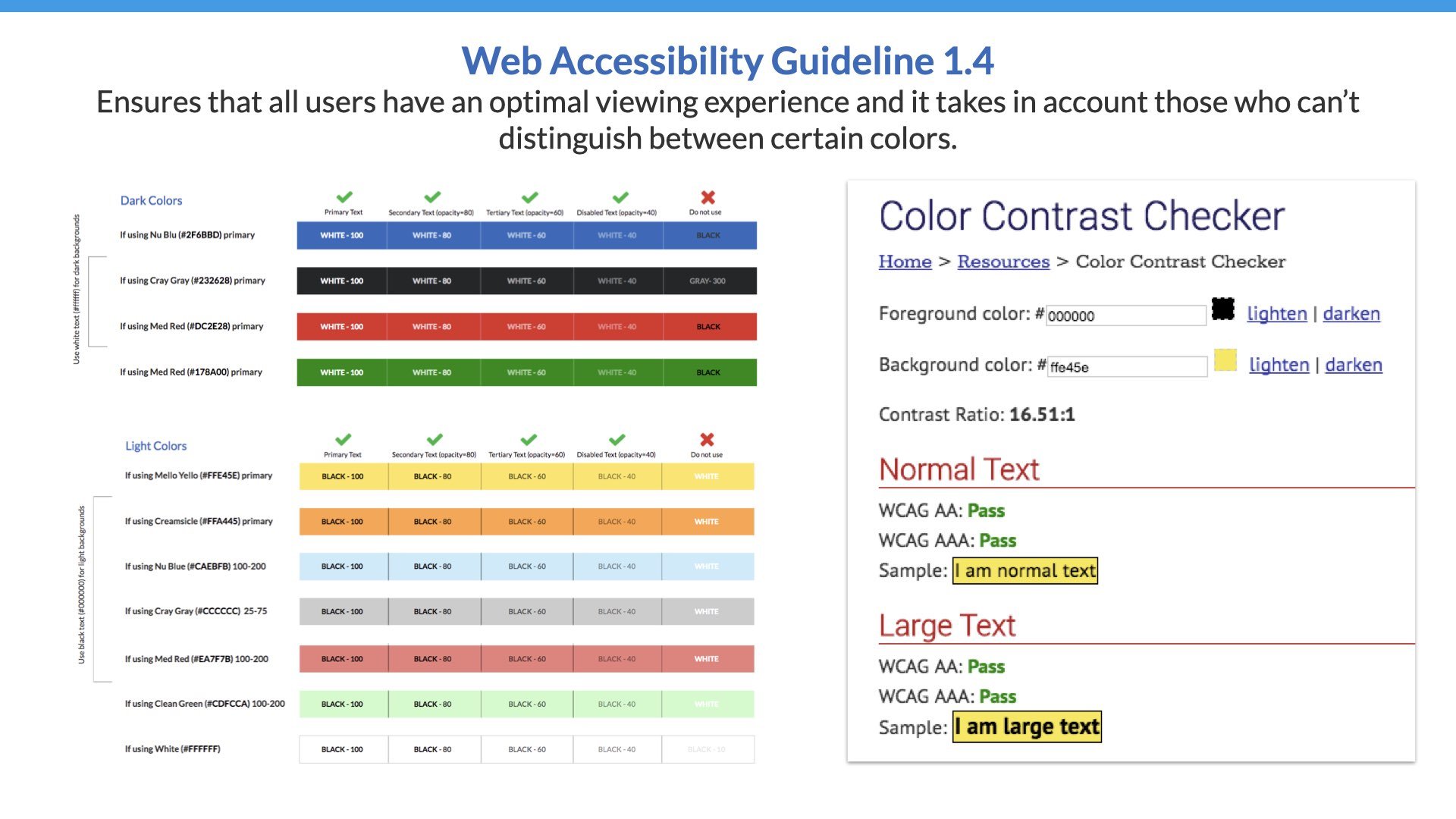
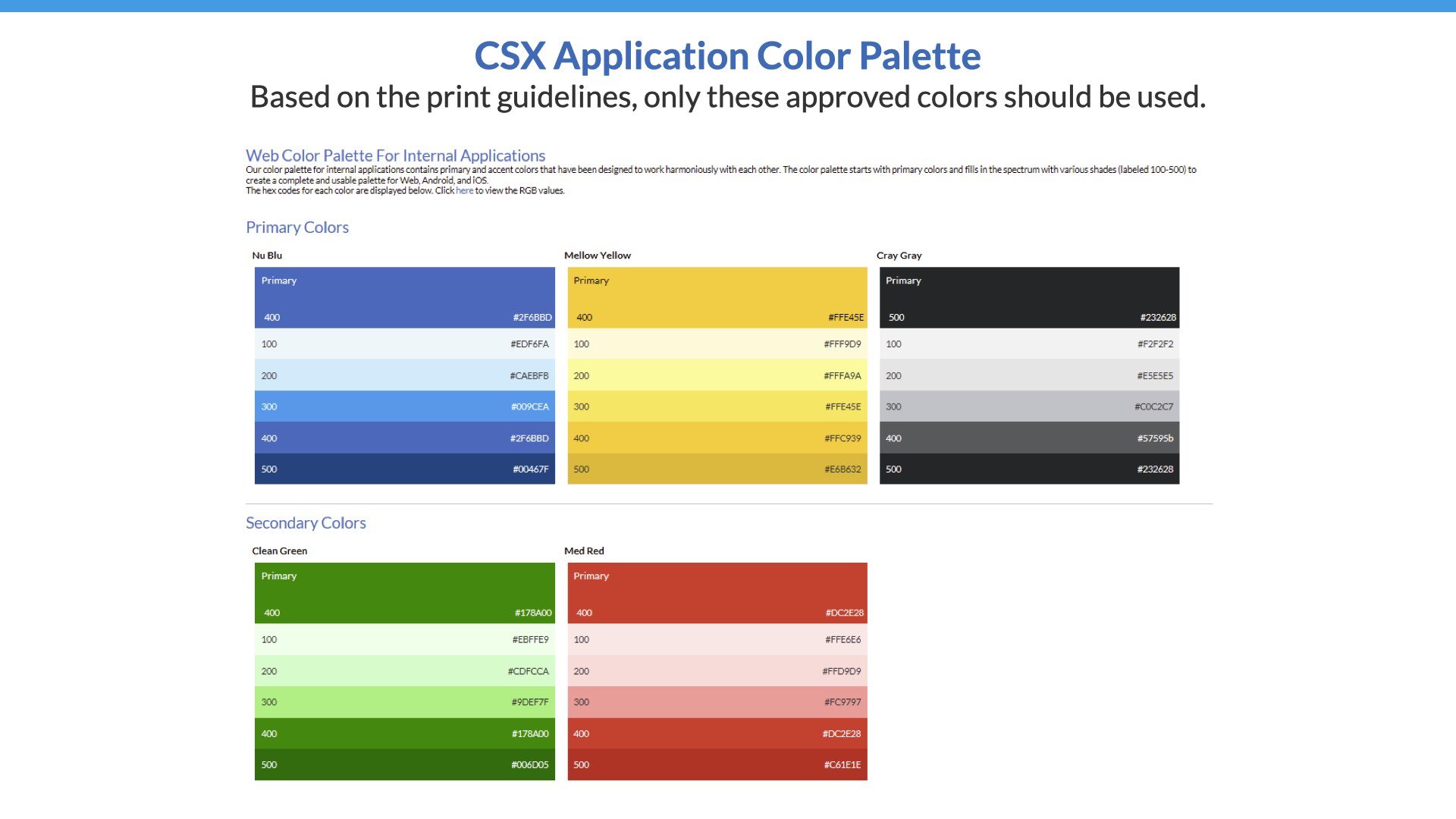
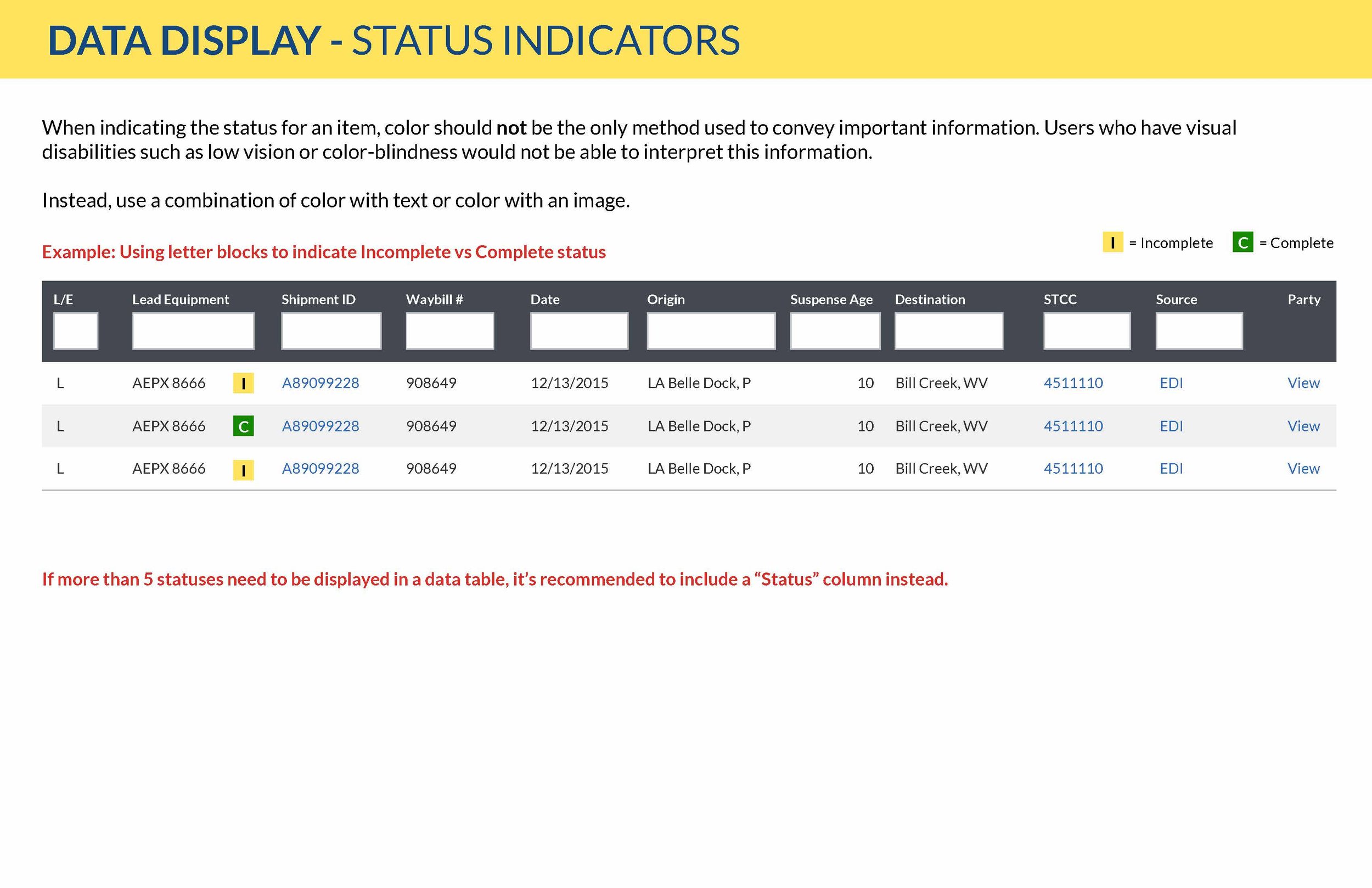
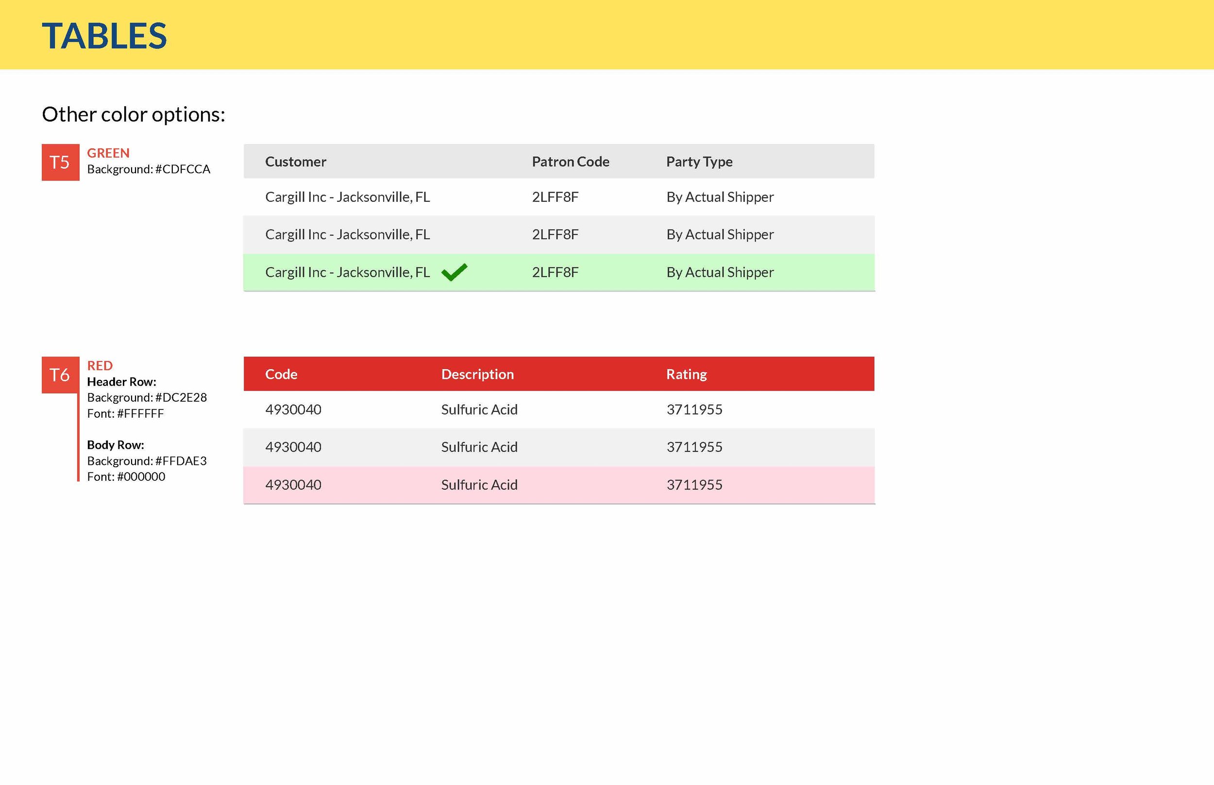
Accessibility & Color
Part of our job is to make sure that the UX is great for all users, including those who may have visual limitations, such as not being able to distinguish between certain colors like red or green.
We took web accessibility guidelines into account when defining a standardized color palette.
Icon Library
The Showcase also featured a searchable icon library of 600+ icons. Developers could find the desired icon and copy a code snippet they can could insert into their application.
We designed the icons in Adobe Illustrator and exported them as SVGs for the library. We also inputted keywords for each icon to make them searchable.

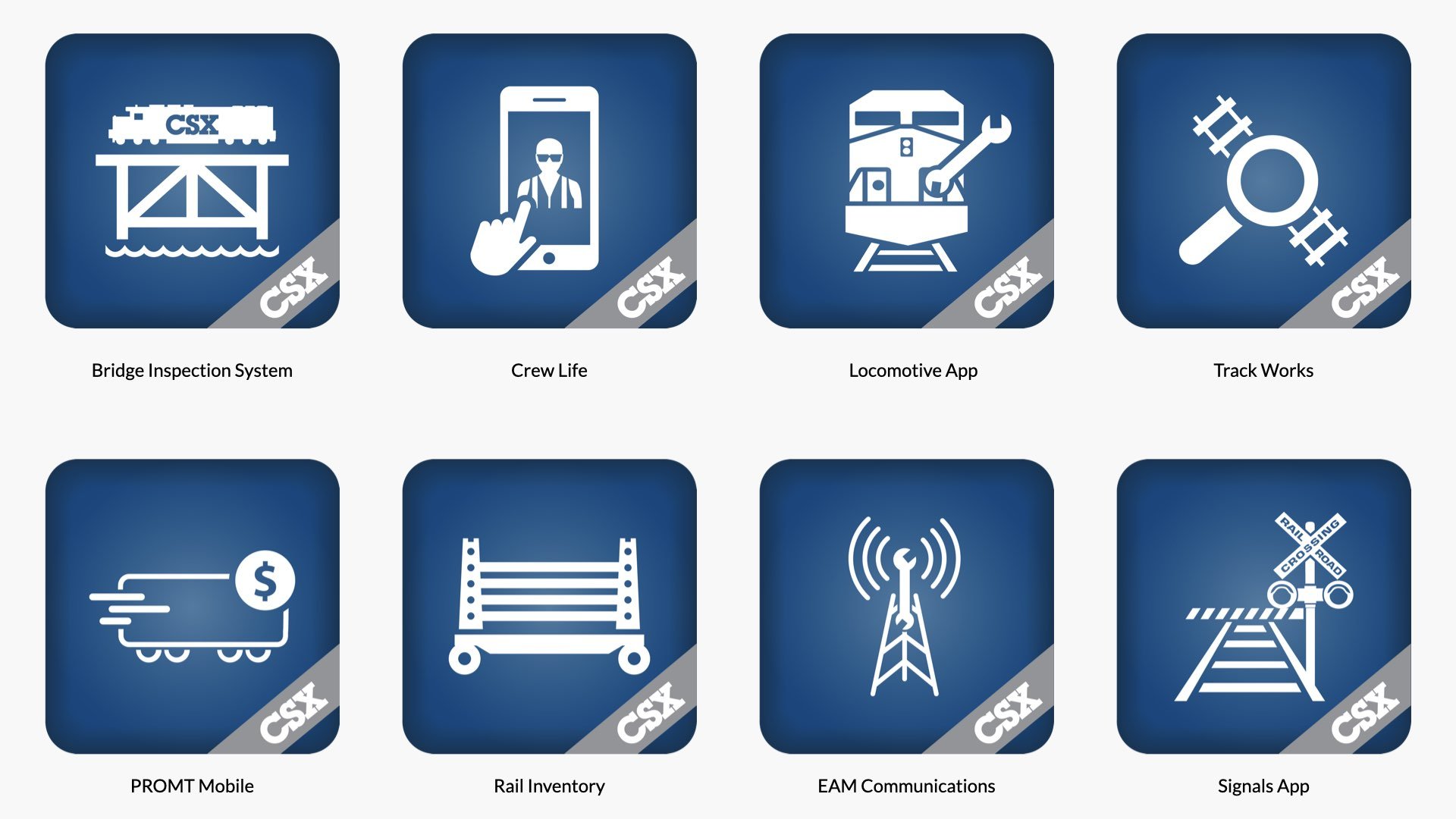
Standardized App Icons
Prior to the design system, mobile apps deployed to the app store did not have consistent branding.
I created an Illustrator template to standardize app icon designs and revamped 30+ existing icons with the template.
The Approach
Using Axure, I designed the prototype for the Showcase layout and navigation, as well as a style guide for multiple re-usable components. UX developers referenced the style guide when building the Showcase.


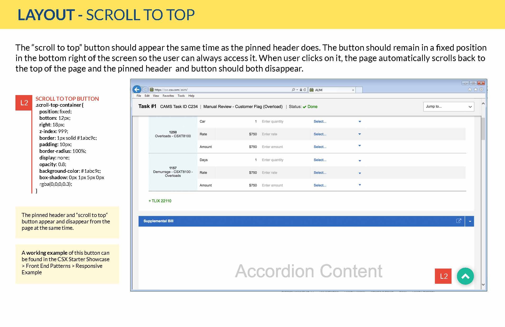
As team lead, I coordinated the creation of our custom Axure Widget Library. With over 80+ drag-and-drop widgets, this allowed us to:
Efficiently create layouts that scaled proportionally when resized
Standardize design deliverables
Re-use interaction models
Make iterative changes to widgets and upload for immediate consumption by design team
Demo of our Axure Widget library

In addition to common design patterns, the UX team also designed a collection of custom modules tailored for our rail applications. Below is a custom module I designed to visualize a train route across various types of stations, incorporating the most common data points end-users preferred seeing.
This module could be implemented across applications that needed to display train route data.

The Impact of the Showcase
-
Alissa H., Sr. Project Mgr I
“[In the past] I would have budgeted a good two weeks of startup time as my newer resource worked with a senior developer to get set up. Not only did the showcase increase our “speed to market” by enabling my new team member to get started immediately, it also eased the workload on the rest of my team.”
-
Aldrich Ruiz, Developer I
“Using the Showcase drastically lowered the development time. The ability to have access to the code snippets helped immensely. Being able to directly see what a piece of code should look like and make minor adjustments to mold the components to your liking made building the pages a breeze.”
Advocating For & Growing Design Mindsets
As UX design lead, I worked closely with my Technical Director on various initiatives to promote the new design system and educate the organization on foundational UX concepts and best practices.
Interactive Workshops
Our team hosted quarterly live interactive workshops called “UX University” for our business partners, business analysts, and developers to learn more about design-thinking.
My role involved organizing the event, designing slide decks and promo material, speaking, and mentoring team members on interactive exercises they would lead with attendees.
UX Wiki
Using Confluence, I created pages to inform the organization on our team’s UX services, educate them on user research methods, and showcase our team’s application portfolio.
Email Communication
For each release, an email was sent to a Software Development Distribution List to communicate new features added to the Showcase. I designed a custom HTML template for this email.
Business Partner Testimonial
For a long-term project I was assigned to, I recorded and edited a video testimonial from the business partner. Our team could use this to help promote our UX services to other departments who hadn’t engaged with us yet.
This helped spread awareness of our services through the organization.


